The Crusaders have unveiled a new logo, but the name will remain the same.
Questions were raised about the appropriateness of the Crusaders name because of its reference to the religious wars between the Muslims and Christians in the Middle Ages.
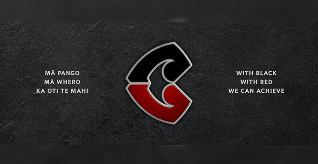
The new logo - which will be used by the Crusaders for branding purposes from now, and will debut on the jerseys in the 2021 season - depicts a red and black Tohu design above the familiar Crusaders name.
The new logo was posted on the Intellectual Property Office of New Zealand website as a trademark currently under examination, a public website.
TVNZ reports the review, which was launched in June, looked at a wide range of topics including the club's identity and the possibility of changing the team's name, along with finding a replacement for the old logo which featured a medieval knight brandishing a sword which critics said had connections to the Crusades - a series of religious wars that pitted Christians against Muslims.
The review was conducted by brand agency Designworks who also put together the club's new branding with their findings.
Chief executive Colin Mansbridge said in the old logo's place, a new Māori-themed logo will be introduced that represents all Crusaders supporters.
The club says the new logo is shaped by the region's natural landscape "which stretches from the top of the Southern Alps to the depths of our moana".
The Tohu takes the forms of the letter C - a move the club says nods to their legacy while moving forward with their new branding, which also features the Cantabrian colours of red and black.
Also tied to the new brand is the Māori whakataukī [saying] "mā pango, mā whero, ka oti te mahi" which translates to "with red and black, the work is complete".
Crusaders coach Scott Robertson said the team's history, which includes 10 Super Rugby titles and many All Blacks greats, was integral to the review and played a big role in keeping the side's name.
TVNZ
ADVERTISEMENT
Stay tuned for the latest news on our radio stations

